Visual Design
Redesigning vlr.gg
A website for following Valorant Esports
Client
School Project
Course
INST703: Visual Design Studio
Timeline
Jan ’22 – Feb ’22
Tools used
Figma
About vlr.gg
The vlr website is a go-to place to check out scores for any particular professional Valorant match happening in India, North America, or even Europe. The website has archival data for pretty much every team and also has rankings for the best teams across various regions. There are other websites that cover similar data but this has been the most used website for quite some time.
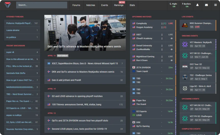
Problems with vlr
The website although covers everything you need in terms of data visually lacks the excitement of the game. With Valorant being so aesthetic in terms of its characters and artwork vlr can also resemble the same with a visual redesign.
Column Structure
The four column structure limits vlr to showcase information in detail and missed out on adding more visual character to the data.
Region wise grouping
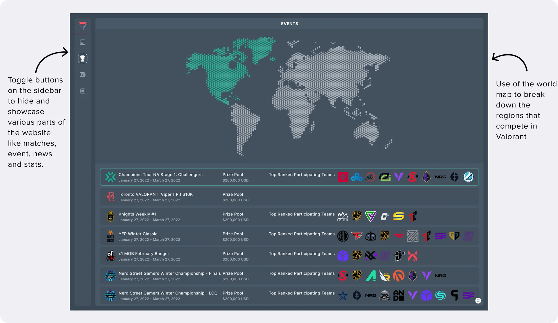
With Valorant Esports split between regions like North America, Europe, Asia-Pacific, etc, vlr doesnt do a great job in showcasing events and matches sorted by the same.
Freedom to customize
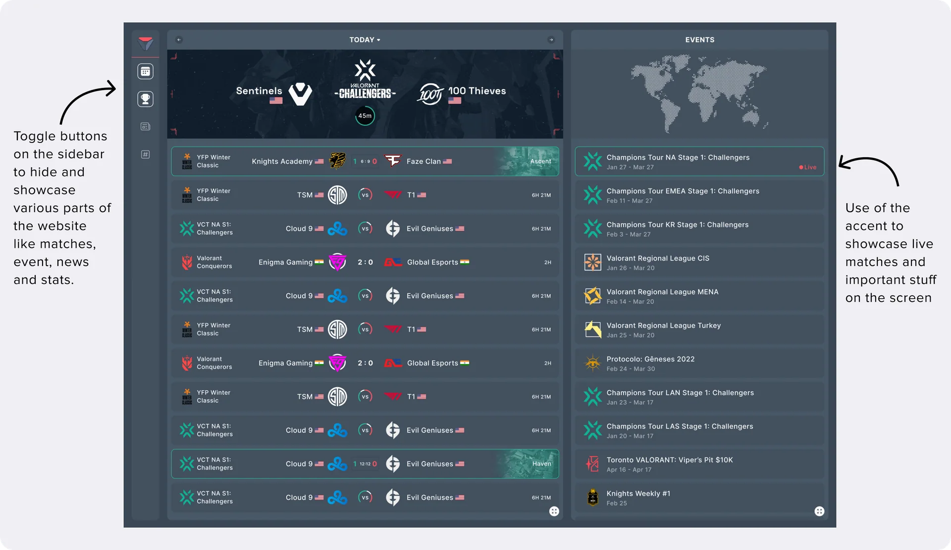
With so much information on the home screen it doesnt let user decide on what is important for them (News, Matches, Events, and discussion forums)
Design System
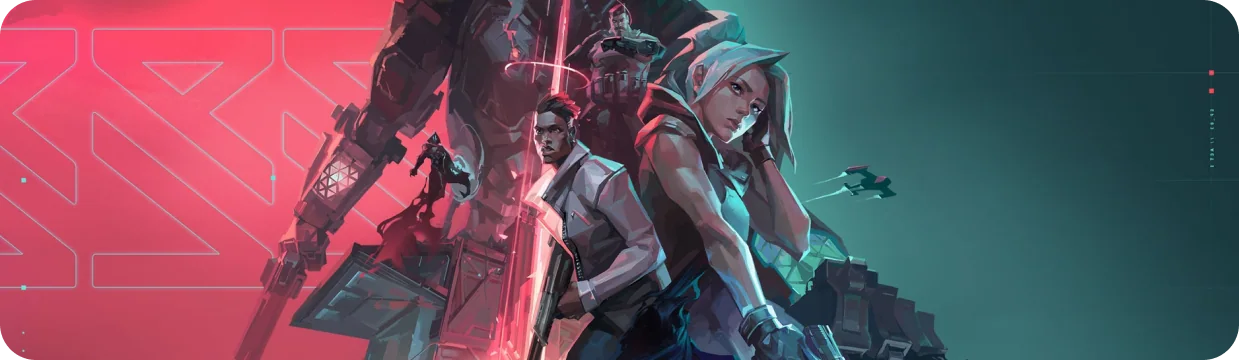
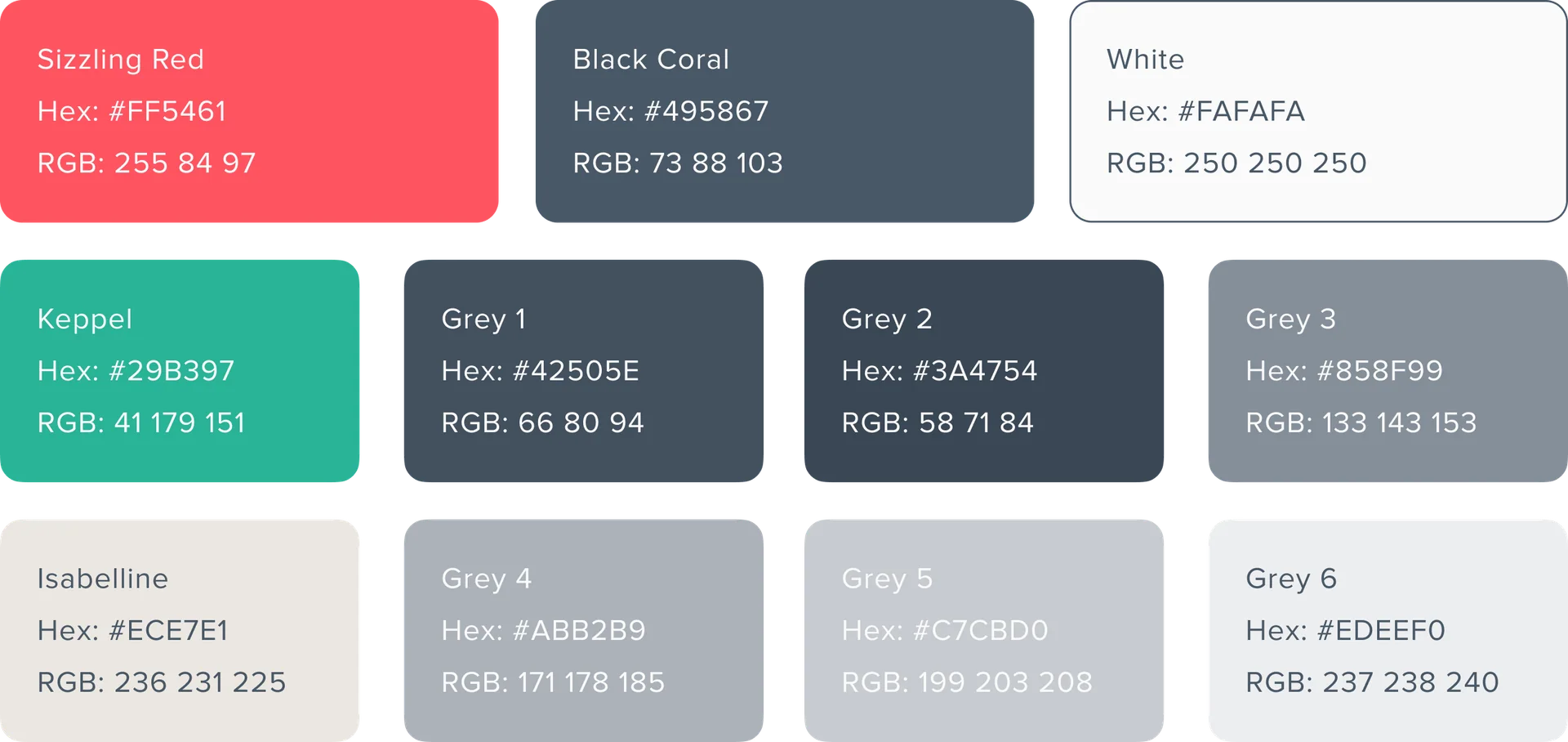
As part of the deliverables, I built a modified design system for vlr. I started off with looking at multiple colors used in valorant and the media that they produce. After some careful observation I was able to understand the use of split complimentary colors in their designs. As I was going for a dashboard like feel it was important to understand that these colors will be used as accents in the website wherease the major colors would be greys and whites.


Typography
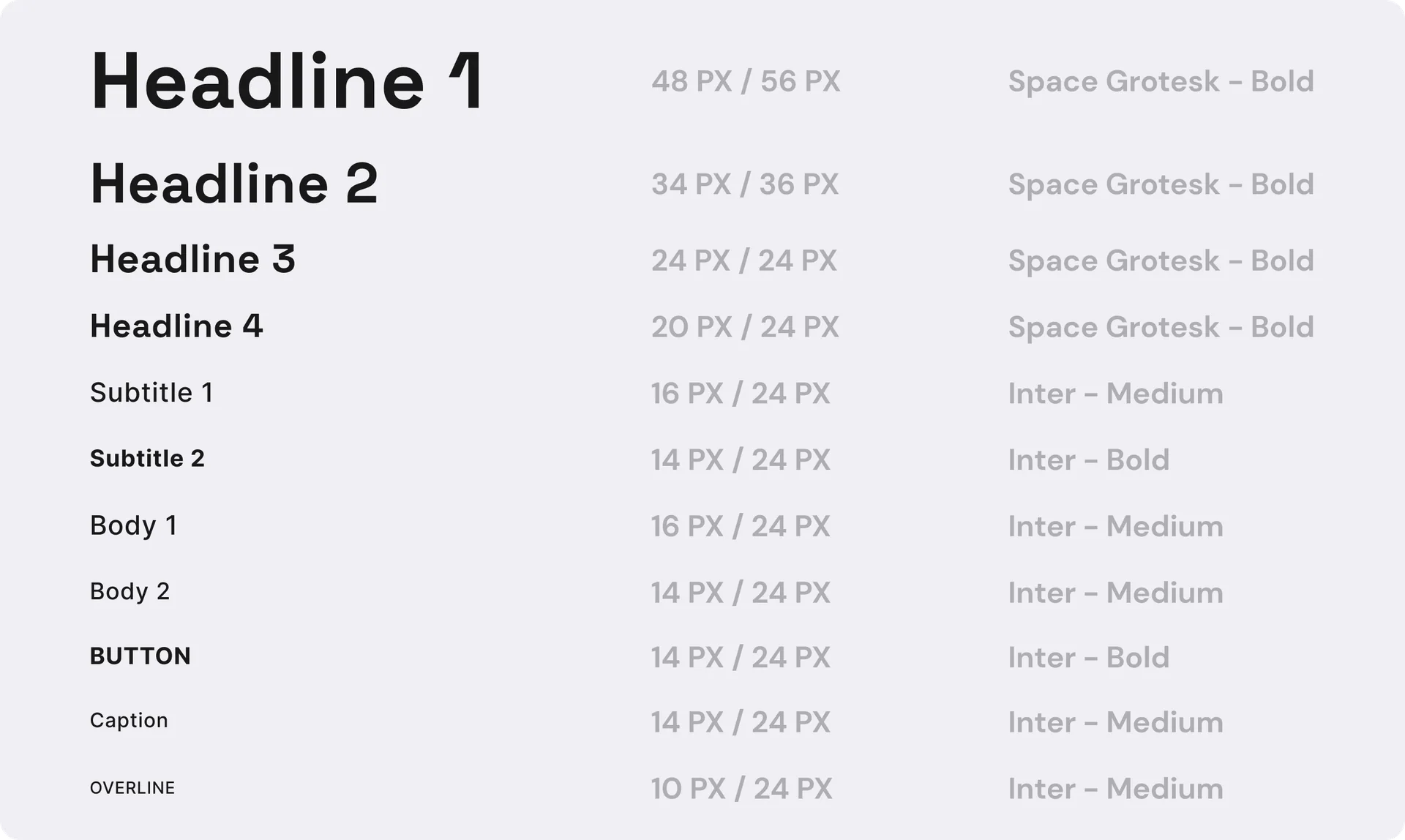
The fonts were sorted out in a way that I don’t lose out the gaming element of Valorant but also keep in mind that the data has to be easily readable.
The Interface
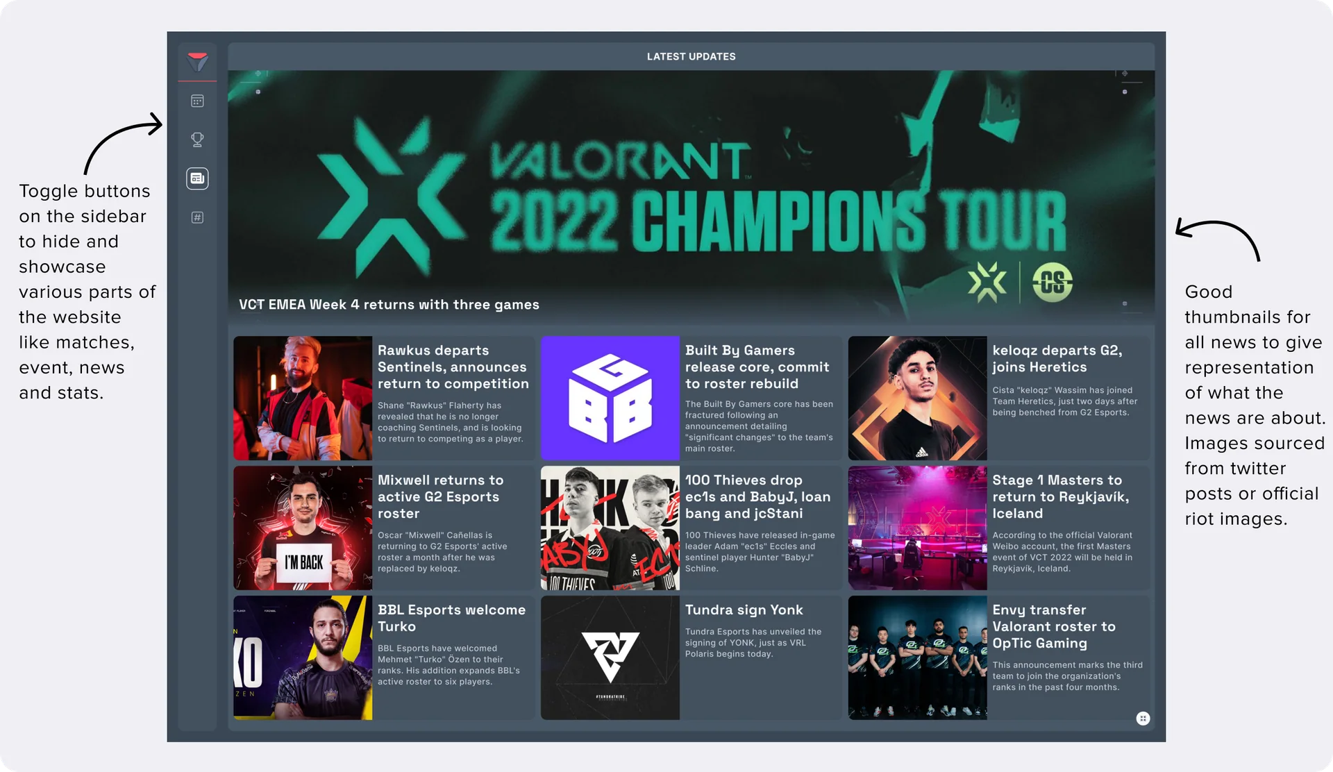
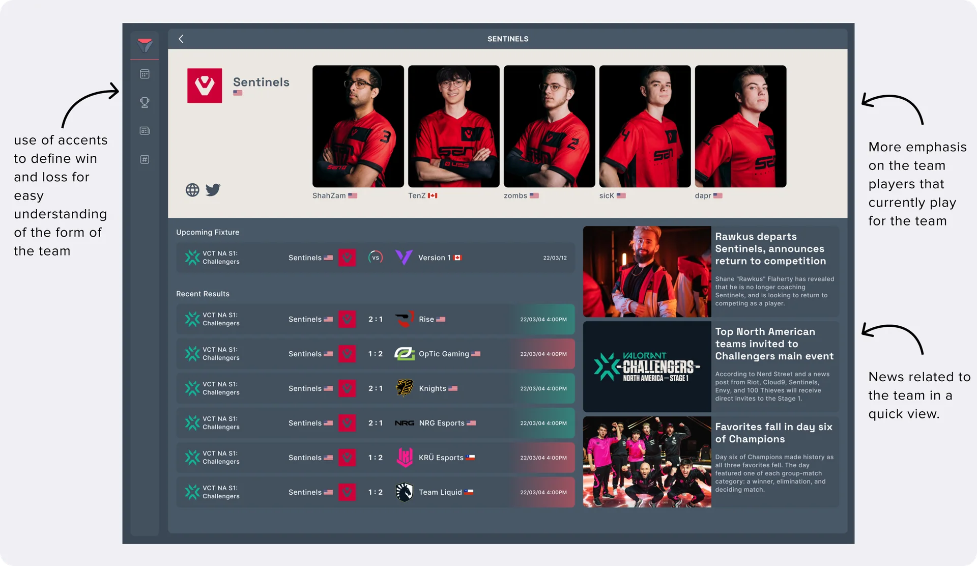
I designed basic components to build a dynamic interface around it. While designing these I always kept in mind that although this is a dashboard it has to have the fun element of gaming in it for the users to enjoy using it.
Feedback and Suggestions
There were a lot of positive feedback about how the navigation was made easy and customizable as per the users requirement. The professor pointed out that he was interested in the website even though he was not interested in the game. He wanted to click around and credited the design for the same.