UI/UX Design
Redesigning a Sports App to Drive 30% User Retention
Enhancing User Experience and Engagement for India’s Premier Fantasy Sports App Through Iterative Design and Data-Driven Insights
Client
NxGn Sports Interactive
My role
Lead Product Designer
Timeline
Jan – Mar ’21
Tools used
Adobe XD and Invision
About the Project
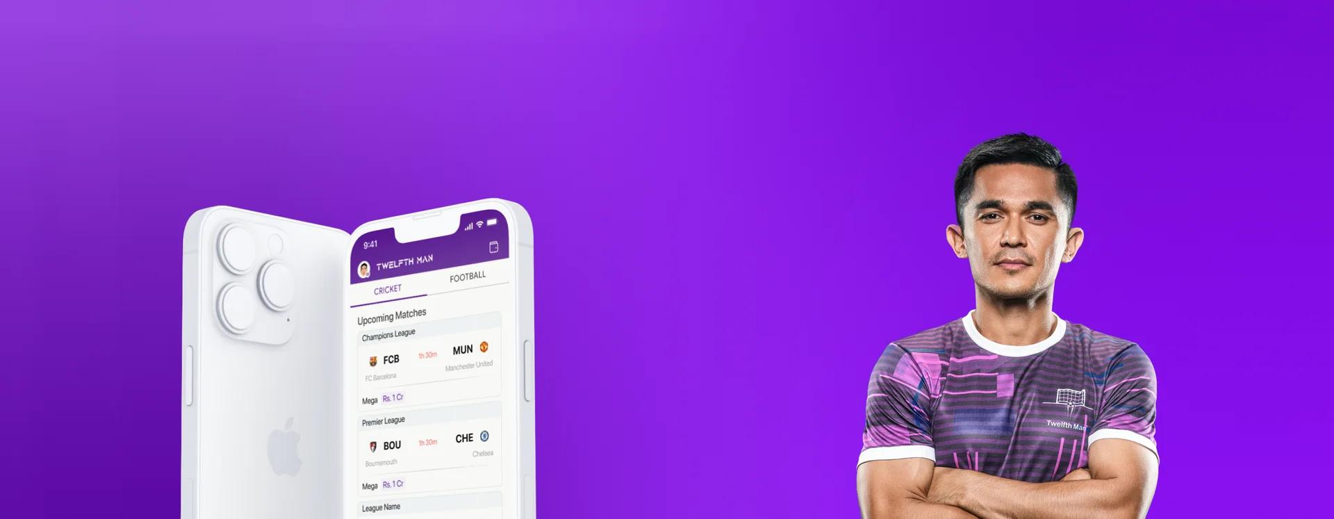
Twelfth Man is a fantasy football app that was released in May 2020. Users select 11 players from real-world sports in their teams and compete with other users. Points are given to the real-world players based on their performances, and users can win cash prizes worth Crores.
Business Problem Statement
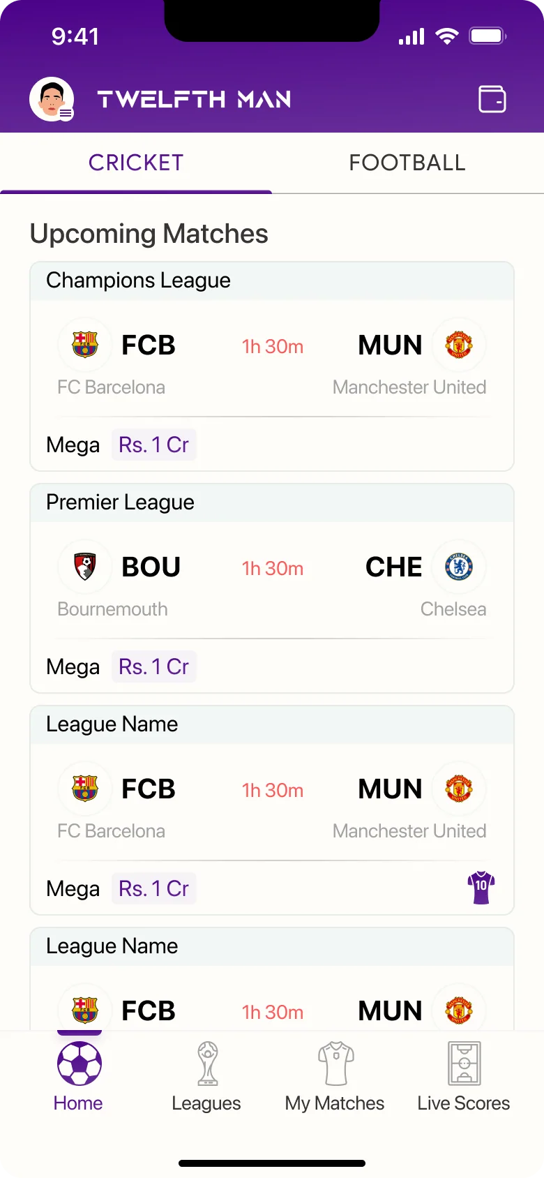
The problem with the app was a high user churn despite heavy investment in marketing campaigns. The idea was to identify choke points in the onboarding process through competitor analysis. The user interface was then required to be redesigned to improve onboarding and reduce churn while increasing engagement and revenue.
Project Goals
- Reduce user churn rate
- Improve onboarding process
- Increase user engagement
- Enhance user interface design
- Boost revenue growth
Design Evaluation and Wireframing
Research Methods
 Market Analysis
 User flow Map
 Stakeholder Interviews
 Current Design Inspection
 Information Architecture
 Usability Testing
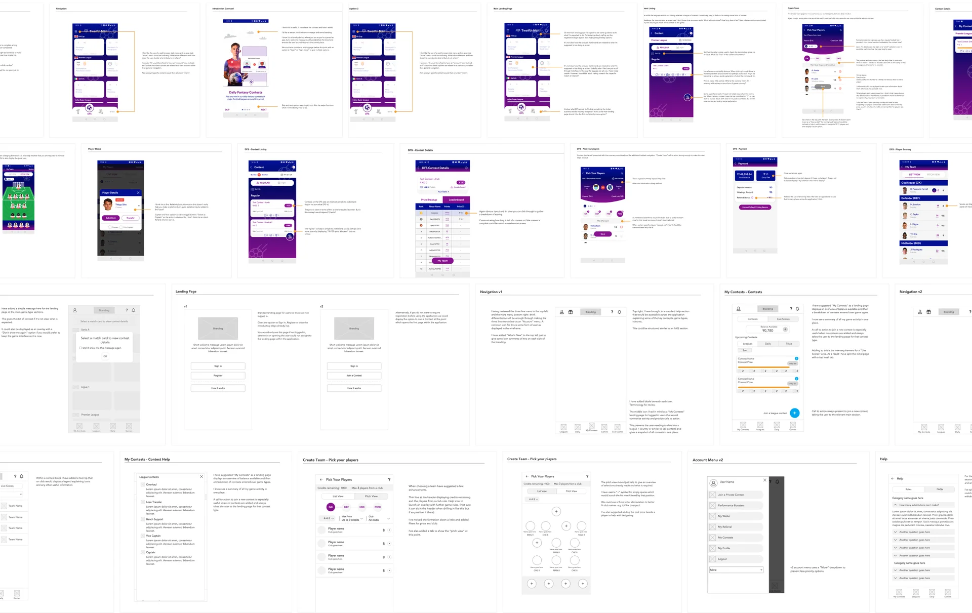
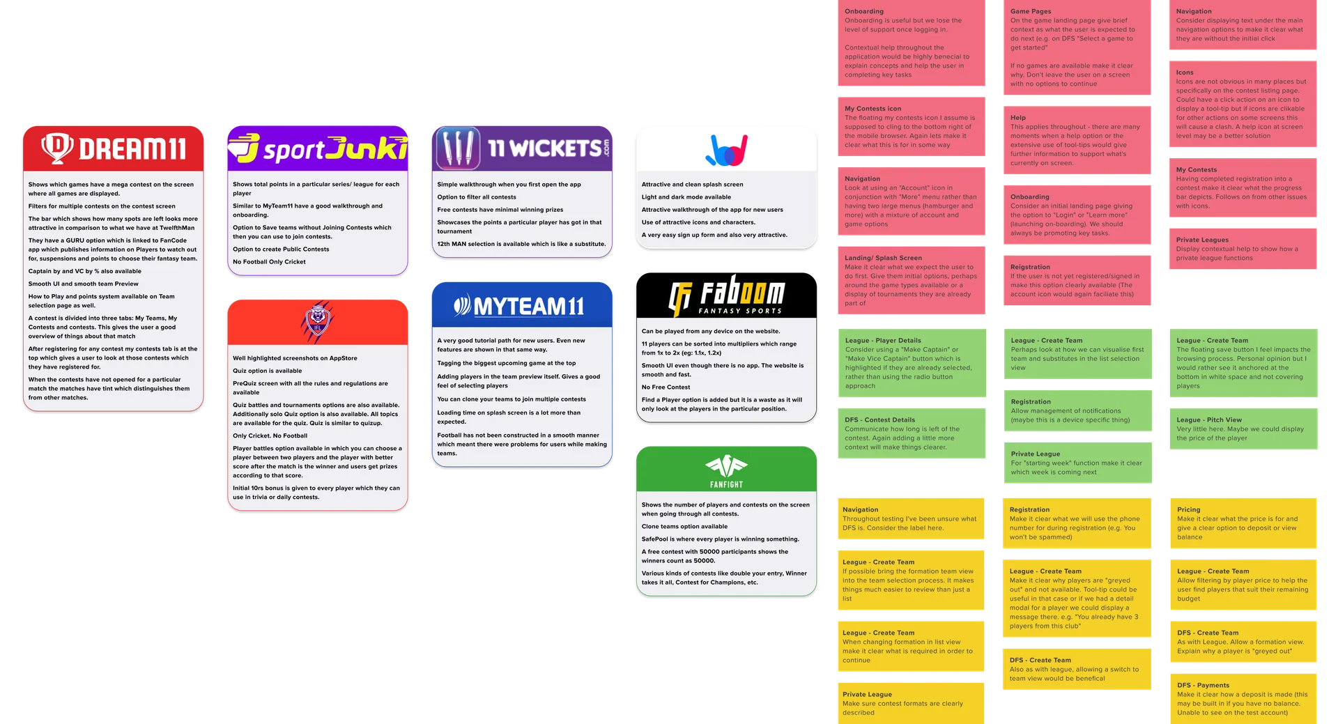
The research conducted for the project yielded valuable insights and led to the identification of several key issues in the user experience. Competitor analysis helped identify gaps in the market, while user flow maps and stakeholder interviews informed the creation of an improved information architecture. Design inspections and usability testing provided actionable feedback, leading to a successful redesign that increased engagement, reduced churn, and improved revenue growth.
Research Artifacts
Account Creation
The login and signup screens have been simplified to enhance the user experience. The design features clear and concise fields, guiding users through the process with ease. This streamlined approach eliminates unnecessary clutter, reducing the time and effort needed to complete the login or signup process.
Simplified Team Selection
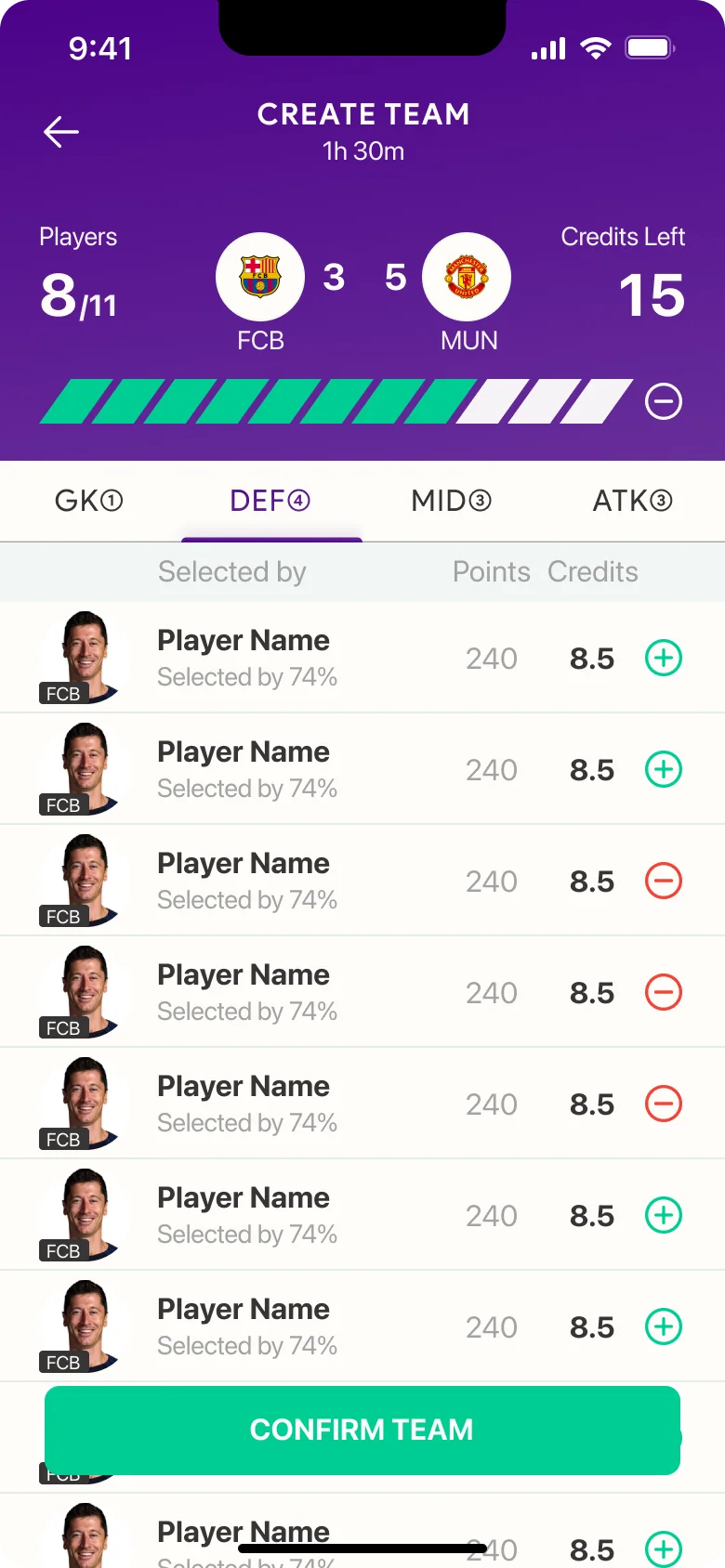
We simplified the contest joining process and added detailed fantasy data. The new design features clear calls-to-action and concise form fields, making it easier for users to join contests. The detailed fantasy data is now prominently displayed, allowing users to make informed decisions.
Improved User Wallet Experience
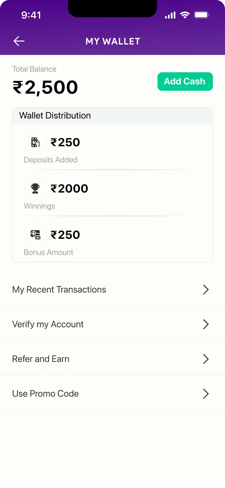
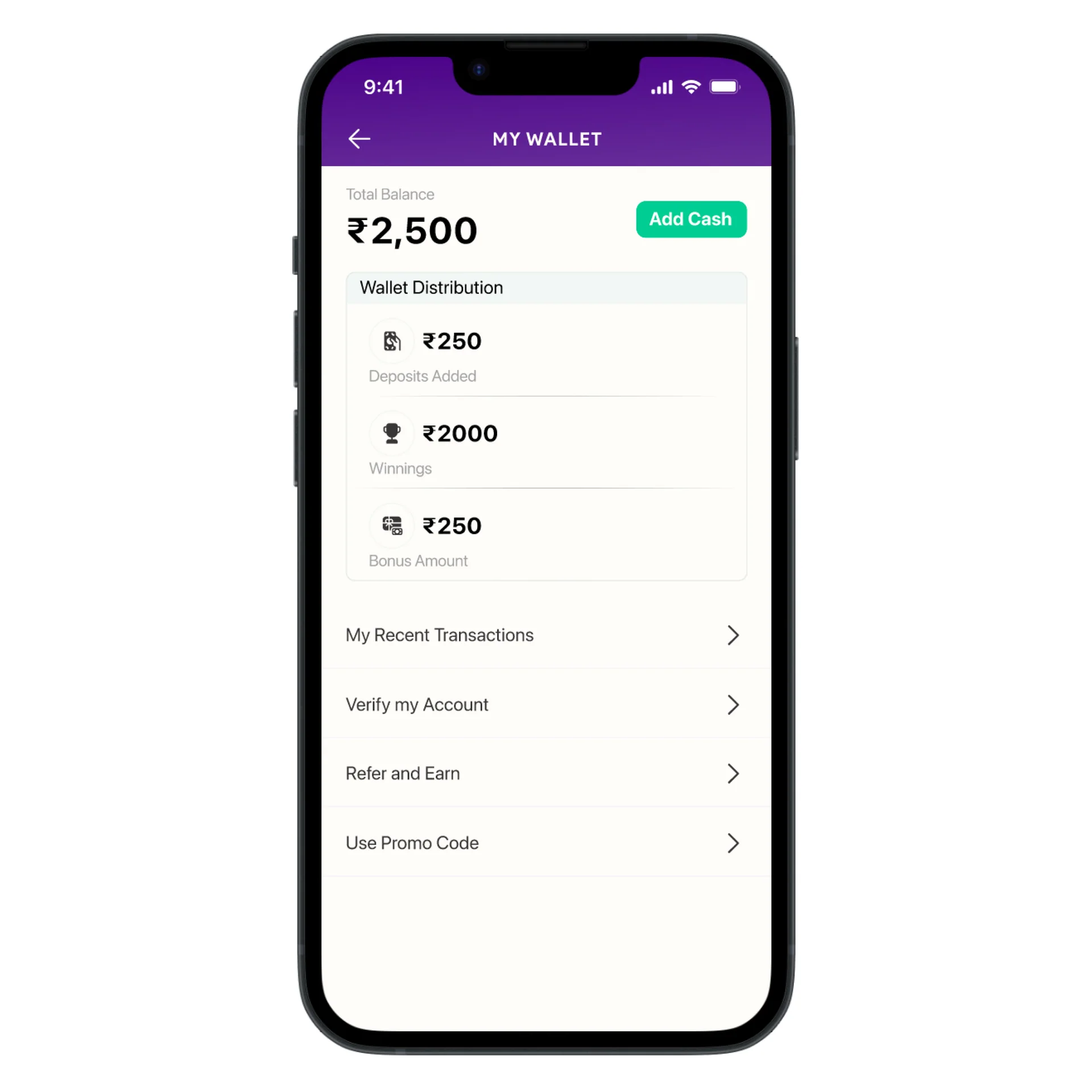
The new design now breaks down the wallet into three categories: deposits, winnings, and bonus money. This simplifies the process for users, allowing them to easily track their funds. This improved the user experience by providing more clarity and transparency in financial transactions.
Gamification to increase retention
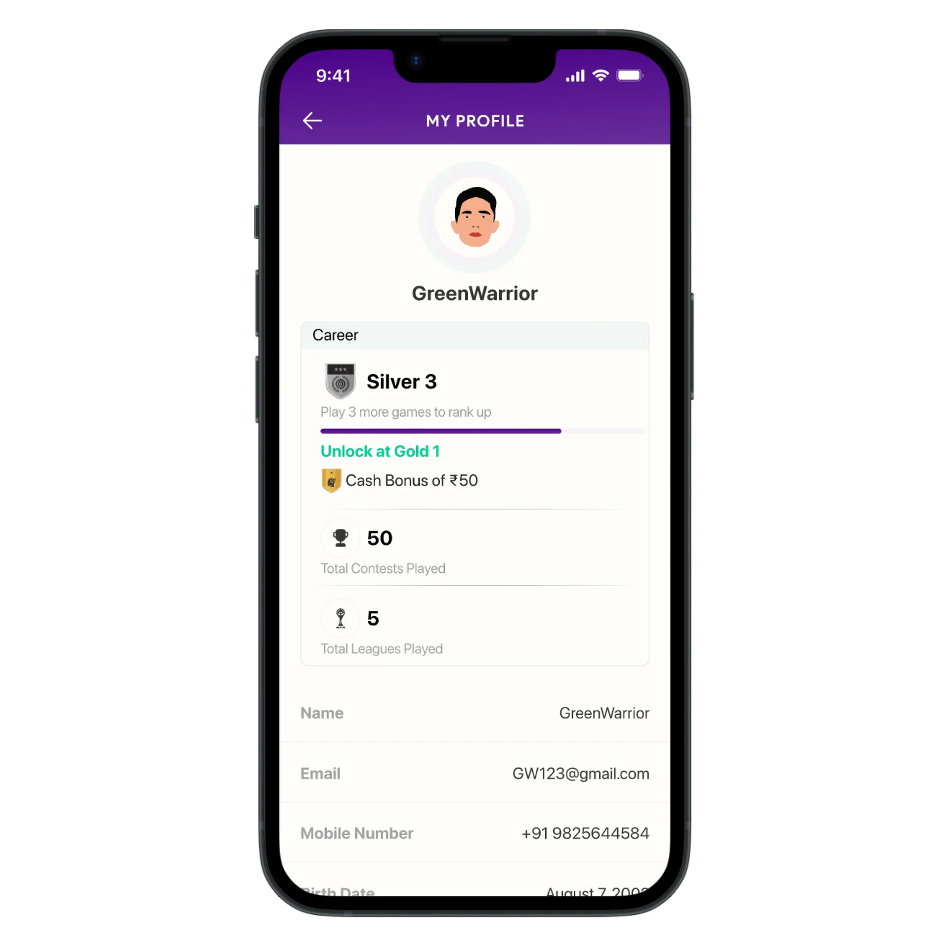
We added a gamification feature to TwelfthMan’s user profiles by introducing bonuses and a ranking system. Users can earn bonuses by completing certain tasks. The ranking system displays each user’s position relative to others in the community, adding a competitive element and motivating users to increase their activity. These additions increased user engagement and retention, making the platform more compelling for users.
Design and Testing
Following the initial design phase, we conducted focused usability testing sessions to evaluate the effectiveness of two critical features: Live Match Updates and the Renewed Team Making feature. The primary goal was to ensure that these features not only met user expectations but also enhanced overall engagement within the app.
We selected a diverse group of participants, including both casual and competitive sports fans, to test these features. The usability tests were conducted using a combination of remote screen-sharing sessions and in-person interactions. Participants were asked to navigate the app while creating a team using the renewed feature and then save that team for future contests, while we observed their actions and collected feedback.
Save Teams Feature
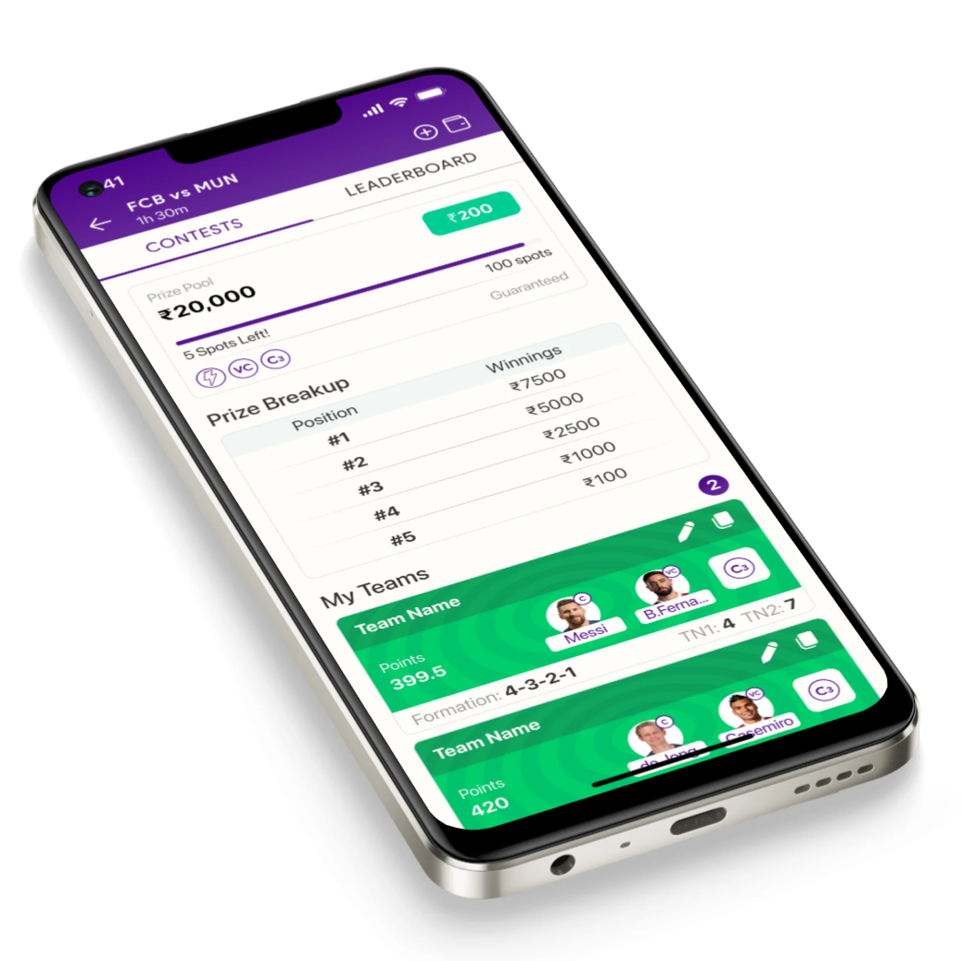
Users found the ability to save teams for multiple contests very useful, but some encountered difficulty in accessing and managing their saved teams across different contests. We enhanced the save function by introducing a more intuitive management interface, allowing users to easily access, edit, and deploy their saved teams in multiple contests. This change resulted in a 25% increase in the successful use of saved teams during subsequent tests.
Renewed Team Making Feature
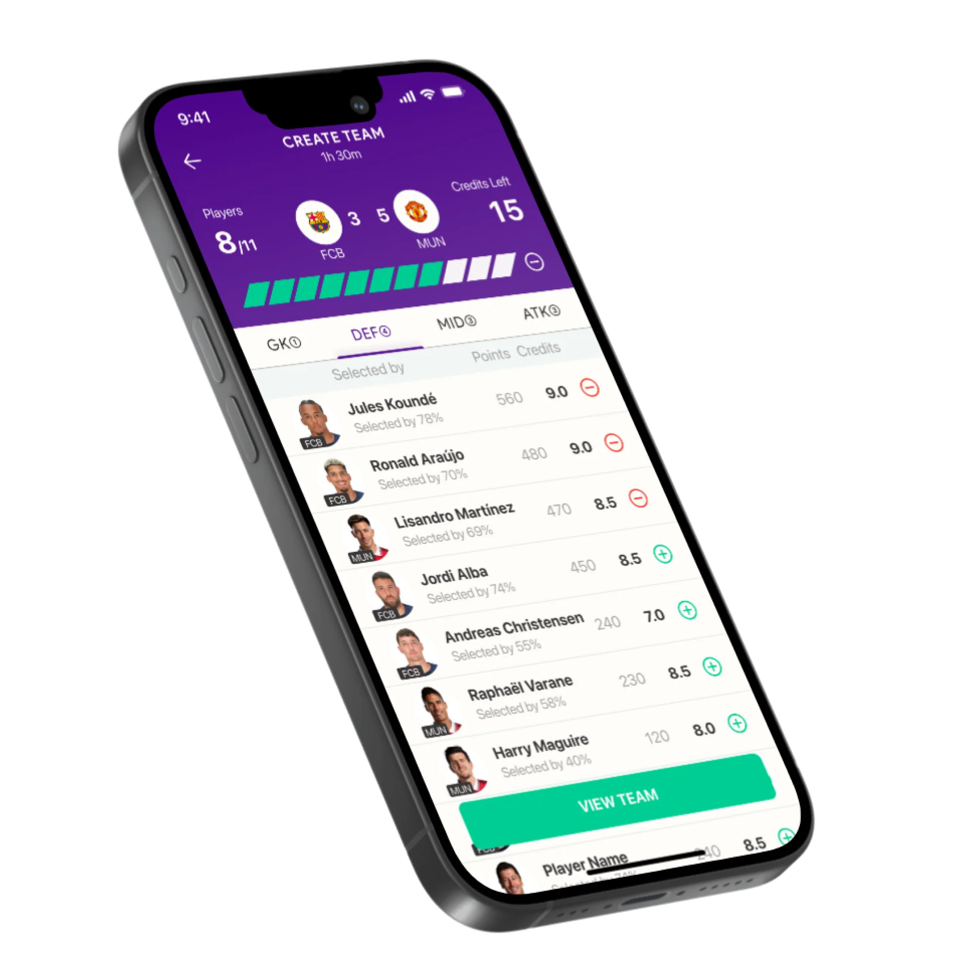
While users found the team-making process intuitive, some struggled with accessing in-depth player statistics, which was crucial for making informed decisions. We integrated an expandable stats section within the team-making interface, allowing users to view detailed player information without leaving the page. This adjustment resulted in a 20% increase in user satisfaction scores related to team creation.
Feedback and Results
After redesigning TwelfthMan’s user experience, including simplifying the login and signup process, streamlining the contest joining process, restructuring the wallet section, and introducing gamification features to the user profile, we launched the new app. The results were impressive.
The impact of the redesign was measured using a combination of quantitative and qualitative data. User engagement was tracked over a three-month period post-launch, using in-app analytics to monitor key metrics such as daily active users, session duration, and churn rate.
The churn rate decreased by 30%, indicating that users were more engaged and satisfied with the new design. Additionally, the cost of acquisition was reduced by 52%, resulting in significant cost savings for the company. These metrics weren’t just snapshots; they were part of a continuous monitoring effort to ensure the redesign’s success was not a one-time spike but a sustained improvement. Regular check-ins and data analysis allowed us to make incremental improvements and maintain the gains achieved through the redesign.
- lower churn rate
- 30%lower churn rate
- lower cost of acquisition
- 52%lower cost of acquisition
- more successful use of saved teams
- 25%more successful use of saved teams
- higher satisfaction with team creation
- 20%higher satisfaction with team creation